

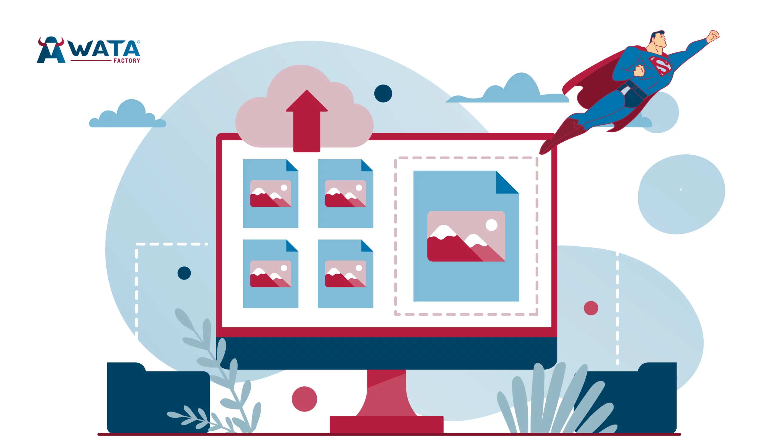
When we think about designing a web page, the first things that come to mind are vibrant colours, elegant and perfectly matched typography, and the harmonious arrangement of different elements. But we tend to forget a silent protagonist that often goes unnoticed, even though it has a huge impact on user experience and web performance: image formats.
Images are not just decorations; they are visual messengers, capable of capturing attention, reinforcing brand identity, and guiding users through a website almost without them noticing. However, if they are not properly optimised, they result in slow pages, blurry images, or visuals that don’t adapt well to different devices, etc. And this is only the tip of the iceberg, because the final consequence is that visitors get frustrated and leave without looking back, heading to another, smoother website where they feel more comfortable.
That’s why, in this article, we’ll show you how to choose and optimise images so your website not only looks amazing but also loads incredibly fast, performs flawlessly, and meets SEO standards. Because yes, a picture is worth a thousand words—but only if you use it well.
Don’t underestimate the impact of images
The power of images lies in their ability to engage, evoke emotion, and connect with users instantly. But beware—when used poorly, they can become your Achilles’ heel. The last thing we want is to distract or even confuse visitors and ultimately damage the perception of your brand.
So, what do images really impact? Here’s the breakdown:
• First impression: Imagine a user entering an online store. If the product photos are well-lit, sharp, and high resolution, the user will trust what they see and find what they’re looking for. But if the images are pixelated or slow to load, the experience becomes frustrating and exhausting. If your website makes things difficult, users will leave with a single click for another one that doesn’t waste their time. In the digital world, first impressions rule—and if they’re not fast and clear, you’re losing customers.
• Loading speed: Large, unoptimised images are responsible for many slow websites. If your page takes more than a few seconds to load, it’s well proven that users simply won’t wait—they’ll go elsewhere. And not only that: Google is also speed-focused and takes loading time into account when ranking your site.
• SEO and ranking: As mentioned, loading speed plays a key role in SEO. If your site is full of heavy images that slow it down, Google will penalise you. And if you want to rank higher in search results, optimising your images is the first step to achieving the performance and visibility your website deserves.
What is the best image format for your website?
The short answer: it depends. The full answer: each image has its ideal format, and choosing the right one shouldn’t be a whim or a random decision—it should be strategic. Factors such as the type of image, the quality you want to preserve, and optimisation needs all play a key role.
To make it simple, let’s review the most common formats and when to use them.
JPEG: The great ally of photography
It’s ideal for images with many tones and colours, offering a good balance between quality and file size, helping your site load faster without losing too much visual quality.
When to use it? Perfect for photographs, banners, and any image with many colours or details.
- Advantages:
- Excellent balance between quality and file size.Compression level can be adjusted to optimise loading speed without losing too much visual quality
- Compatible with all browsers.
- Disadvantages:
- Does not support transparency.
- Excessive compression can reduce visual quality.
PNG: Transparency
If you need images that maintain quality in fine details and edges, PNG is your best ally. Thanks to its transparency support, it’s ideal for compositions where images need to blend perfectly with any background.
When to use it? Ideal for logos, icons, and graphics that require high visual fidelity or transparent backgrounds.
- Advantages:
- No loss of quality.
- Supports transparency.
- Disadvantages:
- Files tend to be larger than JPEGs, which can slow down loading times.
GIF: Simple animations
When you need to add a touch of animation without complexity, GIF is a quick and simple option. Although it only offers a palette of 256 colours, its ease of use and compatibility make it a favourite for simple animations like interactive buttons or small visual effects.
When to use it? Useful for simple animations, moving icons, or loading indicators.
- Advantages:
- Compatible with all browsers.
- Easy to implement for small animations.
- Disadvantages:
- Limited to 256 colours, which reduces image quality.
- Long animations can result in heavy files.
SVG: Scalability for graphics and logos
If you’re looking for an option that guarantees sharp, high-quality images regardless of screen size, SVG is ideal. It’s designed to deliver precise, detailed graphics that adapt perfectly to any resolution without losing quality.
When to use it? Perfect for graphics, logos, or icons that must remain sharp at any size.
- Advantages:
- Scales without losing quality.
- Lightweight and improves loading speed.
- Easily animated with CSS or JavaScript.
- Disadvantages:
- Not suitable for photographs or complex images.
WebP: The image compression revolution
WebP, developed by Google, is a modern format that combines the best of JPEG and PNG in one file. If you want your website to load quickly without sacrificing image quality, WebP is the ideal option.
When to use it? Perfect when you need lighter files without sacrificing visual quality. Also ideal for transparency or animations.
- Advantages:
- Smaller file sizes than JPEG and PNG.
- Supports transparency.
- Maintains high visual quality.
- Disadvantages:
- Not supported by some older browsers.
How to optimise images
Now that you know which format to use, let’s dive into how to optimise images so your website is even faster and more efficient.
1. Choose the right format for each image
As you already know, the key is to consider the type of image and what you need from it:
- Photographs or detailed images: JPEG is standard, but WebP is the future (like the DeLorean of images)
- Logos or icons: SVG is best because it scales perfectly.
- Images with transparency: PNG is your friend, but WebP is also great for optimisation.
- Simple animations: GIF is still common, but WebP or APNG are more efficient alternatives.
2. Adjust the size of images before uploading them
One of the main reasons your website may take a long time to load is uploading images that are too large. If you know an image will be displayed at 800×600 pixels, there is no point in uploading it at a resolution of 3000×2000. In these cases, you can use editing tools such as Photoshop, Figma, or Sketch to adjust the size before uploading them, so the website will load much faster without losing visual quality.
3. Compress images without losing quality
Compression is the art of reducing the size of an image without it being noticeable. There are several very useful tools that allow you to reduce image size without losing quality, which is key to improving your website’s loading speed. Below are three tools to do it easily online:
- TinyPNG: Ideal for compressing PNG and JPEG images without any noticeable loss of quality. It is perfect for reducing image size while keeping them sharp and clear.
- ImageOptim: If you have high-quality images and need to reduce their file size without compromising aesthetics, this tool is one of the best. It works brilliantly for maintaining visual quality while improving performance.
- Squoosh.app: This tool gives you complete control over compression, allowing you to adjust the level according to your needs. That way, you can find the perfect balance between file size and visual quality.
4. Test browser compatibility
Not all browsers support modern formats such as WebP, so it is crucial to offer alternatives to ensure that all users can view your images correctly. Here we explain which types of images work best in each browser:
- WebP: It is compatible with the most modern browsers, such as Chrome, Firefox, Edge, Opera, and Brave. If your goal is to optimise image speed and quality, WebP is the most efficient option for these browsers.
- JPEG: This format is still the most widely compatible and works without problems in all browsers, including older ones such as Internet Explorer. If you cannot use WebP, JPEG is your best alternative.
- PNG: It is also compatible with all modern and older browsers.
- GIF: Universally compatible, this format works in all browsers, although it has limitations in terms of colour quality and file size.
Extra tip: Make sure you use code that allows WebP to be shown whenever possible, but include a JPEG or PNG alternative in case the browser does not support it. This way, you ensure that all users have an optimal browsing experience, regardless of the browser they use.
5. Implement lazy loading
Lazy loading is a very useful technique that allows your website’s images to load only when the user actually needs them, that is, when they are about to appear on their screen. This helps reduce the page’s initial loading time because you do not have to load all the images at once. Instead, only the images visible at that moment are loaded, which makes the user experience much faster and smoother.
Implementing it is very simple: you just need to add loading="lazy" to the image tags in the HTML code. With this, images outside the user’s view will not load until they scroll down and reach them. It is a very effective way to optimise your website without complications.
6. Test and make constant adjustments
To make sure images are not slowing down your website, it is essential to run regular tests. Use tools such as Google PageSpeed Insights, GTmetrix, or Pingdom to see how everything is performing. These tools will show you how images affect loading speed and give you ideas on what you can do to improve it.
Do not forget to run these tests from time to time, especially if you add or change images. Keep your website agile so users do not have to wait, and also to improve your ranking on Google.
At WATA Factory, every image counts
At WATA Factory, we understand that every project is its own world and that attractive images are not enough: they have to be functional, fast, and strategic. That is why we make sure that every image not only has impeccable aesthetics, but also loads at lightning speed and is fully optimised for search engines.
In our design team, we work with a tailored strategy, choosing and adjusting every image to ensure it meets the highest standards of quality and performance from the very beginning. Because for us, the key is to do it right from the start, and this is where Master Yoda’s wisdom comes into play: “Do or do not. There is no try.” If you decide to use images on your website, do it properly. Optimise them so they are fast, lightweight, and perfectly adapted to the page’s performance. If you cannot do it properly, it is better to do without them. In the digital environment, every second counts, and you cannot afford to waste them.